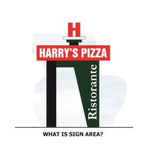
Mini-Case Study: Good Sign Design and Sign Area
The USSC Foundation recently received a member inquiry concerning a proposed new sign in the state of Montana. The Foundation frequently helps supporting members with questions about signs and zoning as a primary member benefit of being a part of the Foundation.
The question from Montana: "What exactly is the definition of sign area and what is the definition of sign structure; are they the same? Or are they different?"
Background Information
Everyone in the sign business is probably quite familiar with the fact that sign codes are a little different in every town, every community, and/or every County in the country. You may find similarities between codes, but you have to read each specific code individually to see what is permitted and how sign area is defined. That will determine how large a sign can be. And what is written in the code determines what the local zoning department can approve, nothing more and nothing less.
The Montana design involved a freestanding sign with individual Channel letters for the copy and a free-form arrangement. There were no flat faces or standardized sign cabinets involved. The sign design was unique, so the town was having difficulty in determining what exactly was “sign area” and what was not, and because of this, tried to consider the entire structure as sign area.
Your local code will define sign area. Sign area typically includes the lettering or communication or messages on the sign structure and the background behind the copy or the framing of the sign cabinet behind the copy. Most codes will not include sign structure or trim or decoration in the calculation of sign area.
Negative Implications
Some codes create one box or rectangle around the entire structure, and everything inside that box or structure is considered sign area. This approach is most punitive for all concerned – communities, sign owners and sign designers.
First, it inhibits good sign design and creativity because all aspects of the sign design must be crammed inside an arbitrary box or rectangle. Decorative or asymmetrical elements cannot be incorporated because they stretch the arbitrary “box” and reduce the size of everything else.
Many communities tell us that they don't want boring generic garden-variety sign boxes on top of poles (or so-called “litter on a stick”) yet at the same time they try to consider the entire structure as sign area. It can’t go both ways. If the entire sign structure is sign area, then you will end up with exactly what the communities don't want; a perplexing situation.
Secondly, if one considers sign structure as sign area, then the overall sign will be smaller, and the actual sign area devoted to the message will be smaller overall.
Based upon USSC Foundation research, we know that sign legibility and visibility are determined by sign size and letter size, there's no way around this, assuming proper contrast and sign proper location and orientation. The ability of a driver to see and read a sign is determined by size, and if one must draw an arbitrary box or rectangle around the entire sign and fit everything inside that box or rectangle, then the sign will tend to be smaller and harder for drivers to see and read, thereby creating traffic safety implications.
Outcome
In the case of the Montana sign, the Foundation was able to analyze the local code and make some suggestions on sign design and hopefully encourage a compromise between the local town and the sign company. If a freestanding sign has individual channel letters, then the letters and the background behind the letters should be counted towards the sign area calculation, and not all the structural areas in between.
The Montana sign design was a high-end design involving sophisticated fabrication techniques. It was a design that communities should want to encourage – designs like these are in everybody's best interest - the community, the applicant, and the sign owner. Good sign design is one that is visible and legible for drivers. Good code helps insure that allowances comply with sign related research.
